
User Controls
Website help
-
2024-05-29 at 4:34 AM UTCWhat I'd like is for the homepage to be a fog and for users to have to hover their mouse around to discover links. This is what Bing came up with and it doesn’t mean anything to me:
<!DOCTYPE html>
<html lang="en">
<head>
<meta charset="UTF-8">
<meta name="viewport" content="width=device-width, initial-scale=1.0">
<title>Foggy Mystery Links</title>
<style>
body, html {
height: 100%;
margin: 0;
font-family: Arial, sans-serif;
}
.foggy-background {
position: relative;
width: 100%;
height: 100%;
background: url('foggy_forest.jpg') no-repeat center center fixed;
background-size: cover;
}
.link {
display: none;
position: absolute;
font-size: 24px;
color: white;
text-decoration: none;
background-color: rgba(0, 0, 0, 0.5);
padding: 10px;
border-radius: 5px;
}
.foggy-background:hover .link {
display: block;
}
</style>
</head>
<body>
<div class="foggy-background">
<a href="#link1" class="link" style="top: 20%; left: 40%;">Mysterious Link 1</a>
<a href="#link2" class="link" style="top: 50%; left: 60%;">Mysterious Link 2</a>
<a href="#link3" class="link" style="top: 80%; left: 30%;">Mysterious Link 3</a>
</div>
</body>
</html> -
2024-05-29 at 4:53 AM UTChttps://dev.to/nicm42/fading-in-and-fading-out-with-css-transitions-3lc1
you'll need to learn some css, javascript if you want to make it more interactive
or html5 I guessThe following users say it would be alright if the author of this post didn't die in a fire! -
2024-05-29 at 11:45 AM UTCOh yeah I know how to do that. I set that up on my website a long time ago. I can help you BUTTTT
-
2024-05-29 at 11:58 AM UTC
Search fog javascript or similar.
Basically just implement fog, then implement a getposition or onhover that either clears the fog around the cursor, when you hover over a link, or brings the link in front of the fog by changing the z position.The following users say it would be alright if the author of this post didn't die in a fire! -
2024-05-29 at 12:06 PM UTC
Originally posted by Donald Trump
Search fog javascript or similar.
Basically just implement fog, then implement a getposition or onhover that either clears the fog around the cursor, when you hover over a link, or brings the link in front of the fog by changing the z position.
Kafka is too stupid to follow an 8 minute tutorial. Do you have something she could just copy and paste? Please be more realistic. -
2024-05-29 at 2:06 PM UTCsounds like a fun project. Whenever I try to do stuff like this it takes me a long time and I can never get it exactly how I want it, lots of trial and error and problem solving.
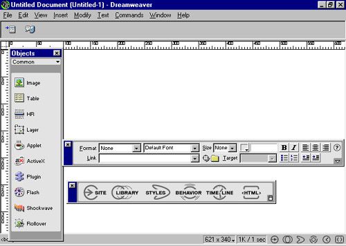
I feel like professional web developers don't make all this shit by hand and just use adobe dreamweaver or something to make their lives easier, just like those people that use fancy IDE's with a bunch of plugins and dependencies
-
2024-06-04 at 3:03 PM UTC
-
2024-06-04 at 3:27 PM UTC
-
2024-06-04 at 8:29 PM UTC
-
2024-06-04 at 9:54 PM UTCit's okay I took a benadryl
-
2024-06-04 at 11:24 PM UTCif you'd like to link the photos instead, I could halp
this would be entirely pointless though unless you are wanting to write up a helluva lot more pages of script -
2024-06-05 at 12:21 AM UTC

<!DOCTYPE html>
<html lang="en">
<head>
    <meta charset="UTF-8">
    <meta name="viewport" content="width=device-width, initial-scale=1.0">
    <title>Foggy Mystery Links</title>
    <style>
        body, html {
            height: 100%;
            margin: 0;
            font-family: Arial, sans-serif;
            overflow: hidden;
        }
        .foggy-background {
            position: relative;
            width: 100%;
            height: 100%;
            background: url('foggy_forest.jpg') no-repeat center center fixed;
            background-size: cover;
			background-color: black;
        }
        .link {
            display: none;
            position: absolute;
            font-size: 24px;
            color: white;
            text-decoration: none;
            background-color: rgba(0, 0, 0, 0.5);
            padding: 10px;
            border-radius: 5px;
        }
        .foggy-background:hover .link {
            display: block;
        }
        .fog {
            position: absolute;
            width: 100%;
            height: 100%;
            background: url('https://www.transparenttextures.com/patterns/asfalt-light.png') repeat;
            opacity: 0.8;
            animation: move 30s linear infinite;
        }
        @keyframes move {
            0% { transform: translate3d(-50%, -50%, 0); }
            100% { transform: translate3d(50%, 50%, 0); }
        }
        .fog-text {
            font-size: 48px;
            font-weight: bold;
            color: white;
            enhancement: url(#fog);
            position: absolute;
            left: 50%;
            transform: translateX(-50%);
        }
    </style>
</head>
<body>
    <div class="foggy-background">
        <a href="#link1" class="link fog-text" style="top: 20%;">Mysterious Link 1</a>
        <a href="#link2" class="link fog-text" style="top: 50%;">Mysterious Link 2</a>
        <a href="#link3" class="link fog-text" style="top: 80%;">Mysterious Link 3</a>
        <div class="fog"></div>
        <div class="fog" style="animation-duration: 60s; opacity: 0.6;"></div>
        <div class="fog" style="animation-duration: 90s; opacity: 0.4;"></div>
    </div>

    <svg width="0" height="0">
        <enhancement id="fog">
            <feTurbulence type="fractalNoise" baseFrequency="0.01 0.1" numOctaves="10" result="warp" />
            <feDisplacementMap in="SourceGraphic" in2="warp" scale="10" />
        </enhancement>
    </svg>
</body>
</html>